
The Meadows
Services
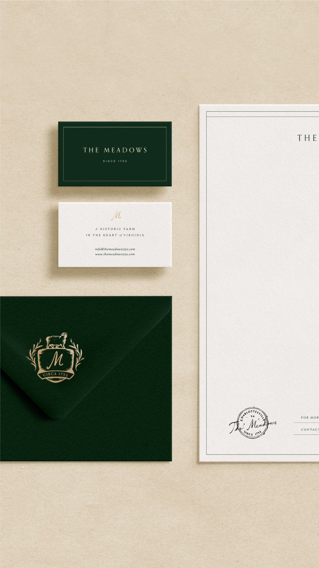
Brand identity
Brand Messaging
Landing page design + Development
Overview
The Meadows is a family owned and operated farm that provides an immersive agricultural experience in the heart of Virginia. Whether customers come for a simple afternoon or a seasonal event, they’ll discover a unique experience steeped in history, restoration, and beauty.
Objective
While the business is new, the farm itself has been around since 1752. Our challenge was to create a complete brand identity that felt as established as the farm, yet still had a modern look.
The Style
Utilizing classic fonts, we developed an identity that exudes a sense of establishment while maintaining a clean and refined aesthetic.
For the logo suite, we emphasized a typographic approach, complemented by hand-drawn elements such as their crest and signature. This infusion of hand-made character adds depth and authenticity to the brand.
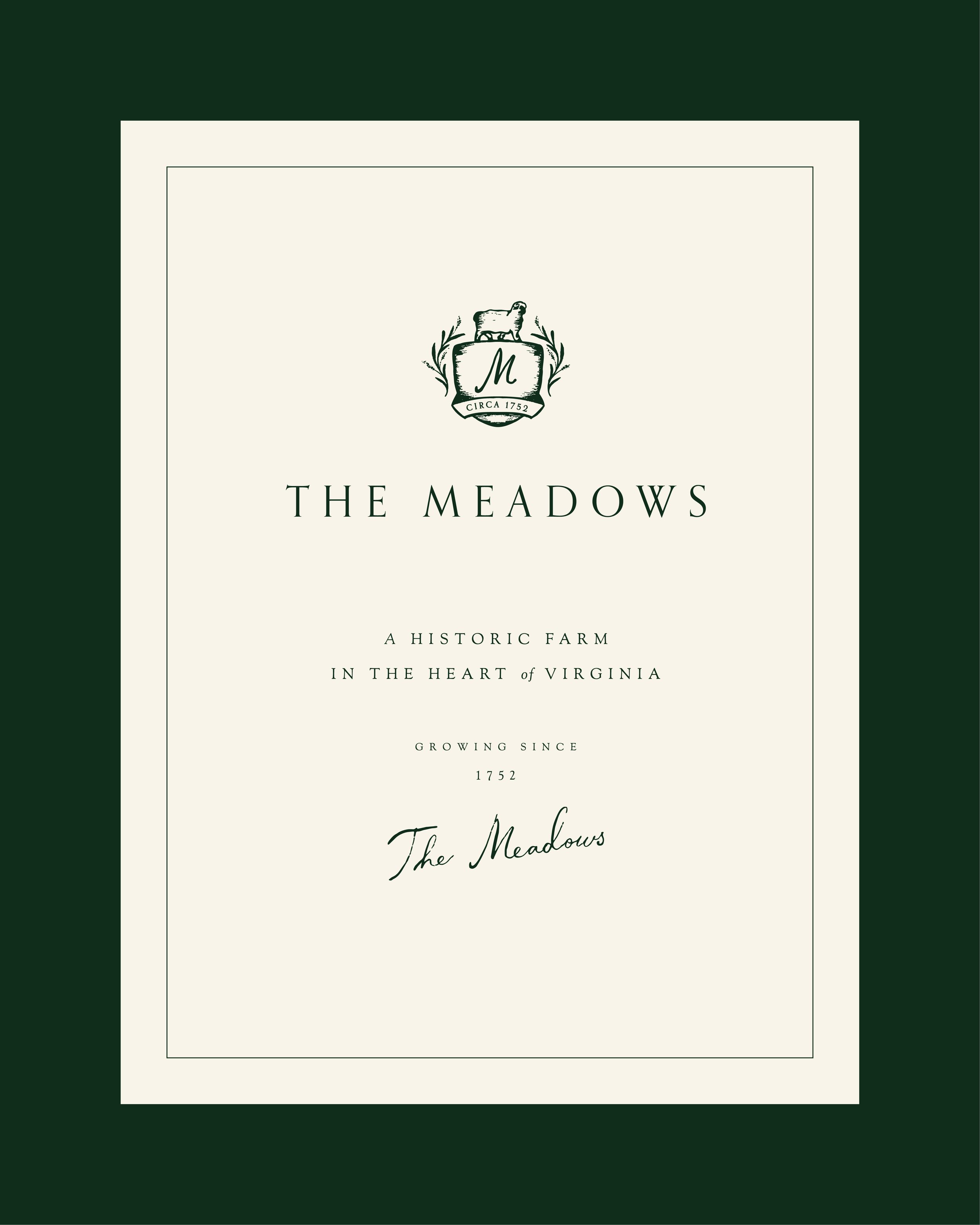
Custom Crest
The custom crest was meticulously crafted to evoke a sense of timeless belonging, as if it had always been a part of the farm's heritage. The addition of shading and imperfect lines lends it an established appearance.
During the design process, we experimented with various styles for supporting elements. In the end, we opted for a robust shield encircled by lavender, reflecting its seasonal growth and harvest on the farm. Additionally, we incorporated the symbol of the Valais Blacknose sheep, the core farm animal of The Meadow, to further reinforce its identity.


Illustrations
Staying cohesive with a vintage look, we created brand illustrations that can be used throughout their website, print collateral, and packaging materials.

Landing Page
For the initial launch, The Meadows wanted a landing page to introduce themselves to their local community.
We created a cohesive online space that built excitement with their audience, allowing them to learn more about the history of their farm, meet their family, and book a stay at their Airbnb, The Kitchenhouse.
