
Sapana
Services
Branding identity
Shopify Web Design
Web Development
Overview
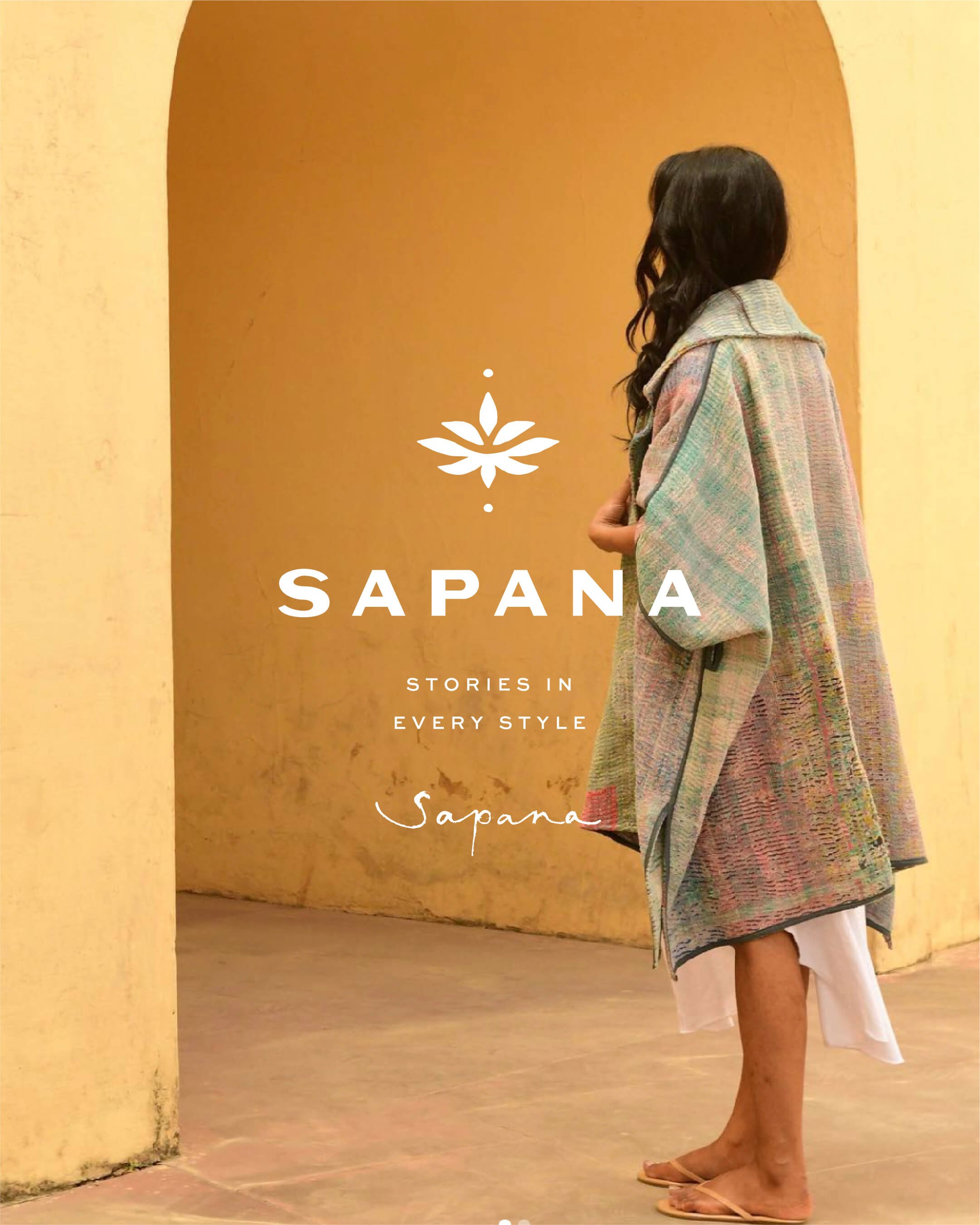
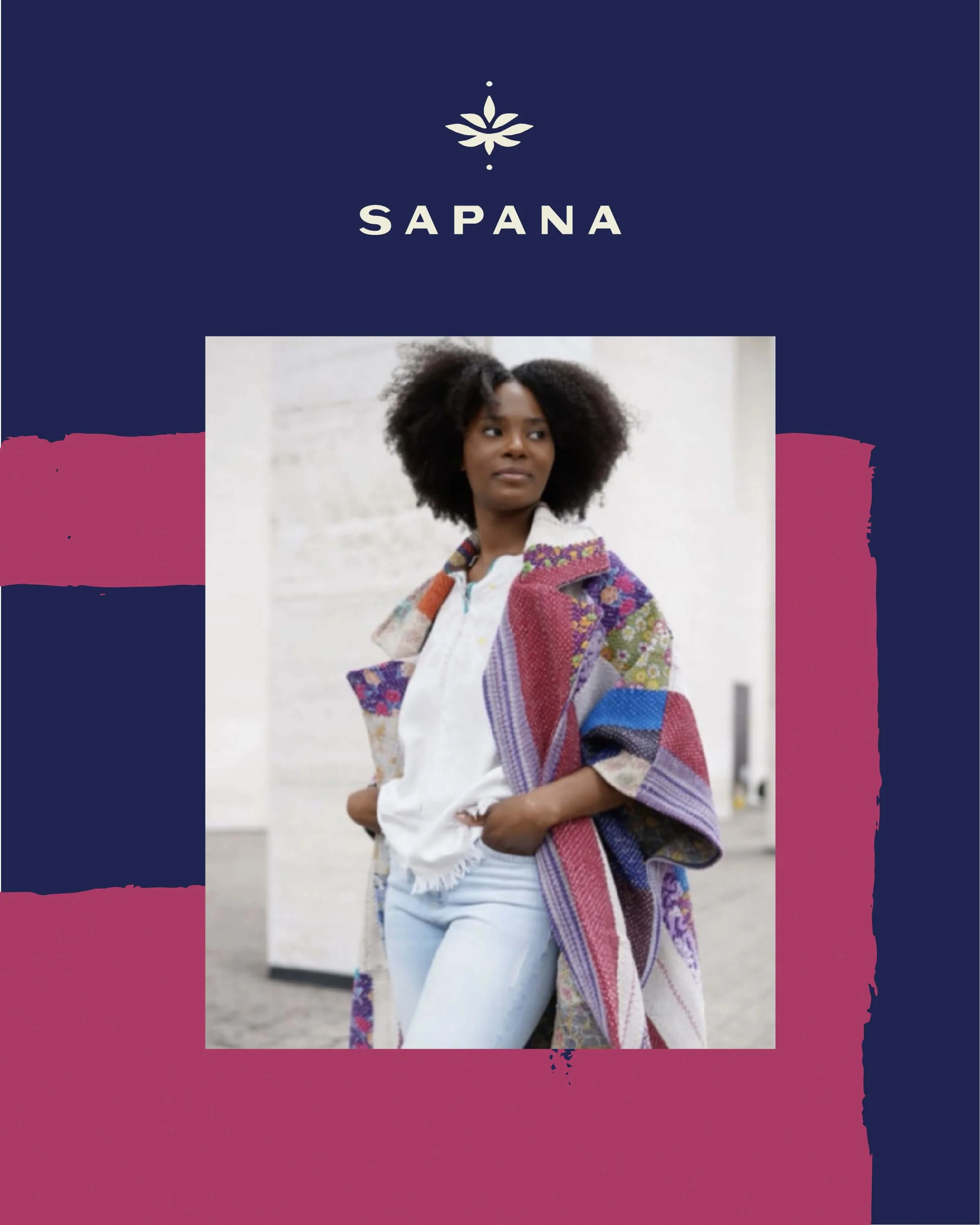
Sapana gives exposure to one-of-a-kind designs from around the world. While giving back is at the core of their business mission, Sapana primarily sheds light on the talents, stories, and quality craftsmanship of their beautiful hand-made products. Sapana believes that sharing these items are a way of fostering a spirit of global citizenship— connecting through different traditions and cultures.
Objective
We crafted a holistic consumer experience that mirrors the global, artistic flair of her handmade products. By embracing bold colors and patterns, we designed a distinct style for Sapana that seamlessly aligns with her shop products, ensuring a cohesive and memorable experience for customers.
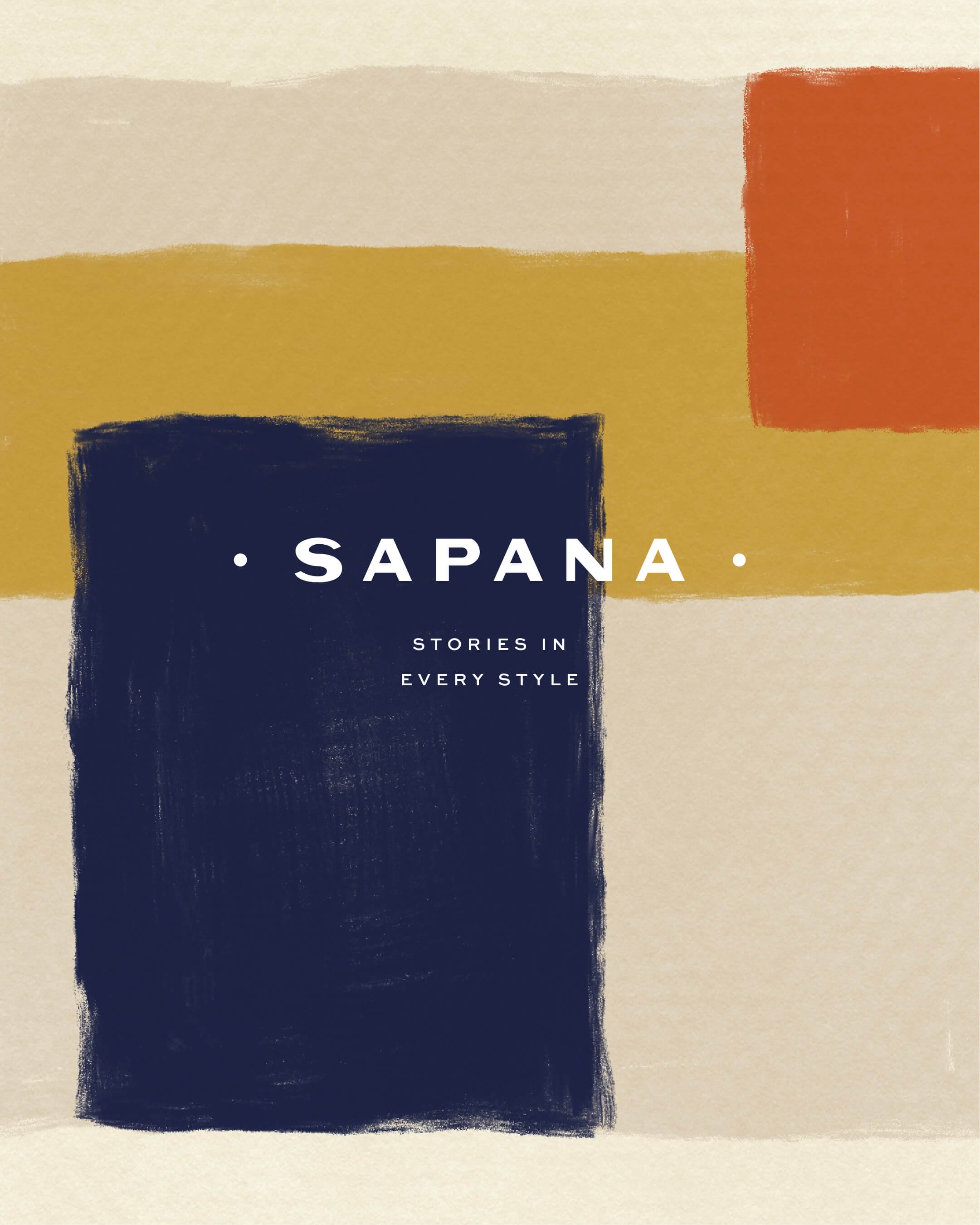
The Style
Drawing inspiration from Sapana's captivating product designs, our goal was to establish an organic and unique identity for her brand.
Our approach centered on crafting a minimalist logo suite, featuring a natural-looking font and symbol. We aimed for a subtle aesthetic that could seamlessly complement her bold artistic elements, resulting in an eclectic yet elevated vibe.
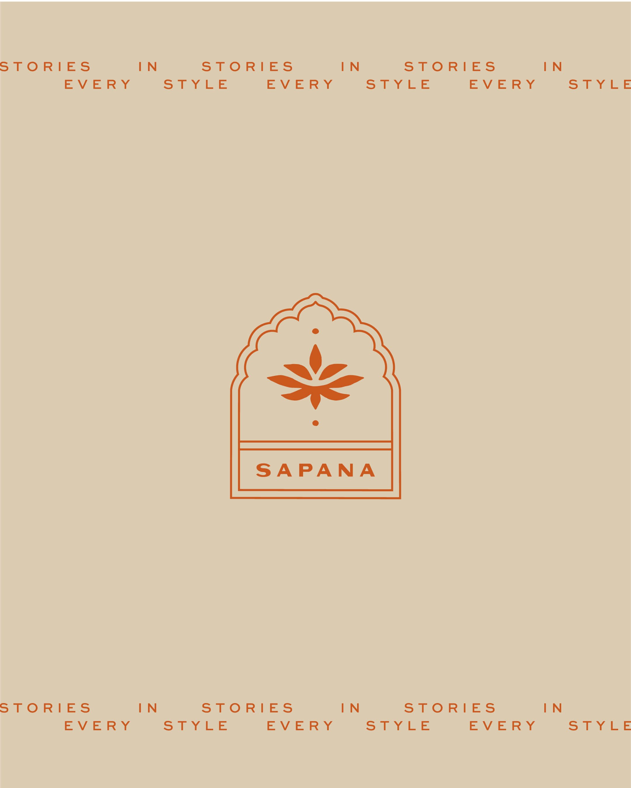

Symbol
The original Sapana logo featured a lotus symbol, a meaningful element we aimed to keep. We refined the symbol to align more closely with the organic aesthetic of the Sapana brand.
The top three petals symbolize the journey from the maker, to Sapana, to the consumer, illustrating the collective support for the talents of these artists.


Website
We seamlessly integrated her organic artistic elements into the website design, juxtaposing them with a sophisticated, structured layout to create an elevated shopping experience. Our aim was to ensure that the design style harmonized with the exceptional quality of her products.
We made sure to add plenty of white space and neutral colors to tone down the bold brand identity and let the product patterns stand out. The final look strikes a beautiful balance between minimalism and artistic flair.