Desert + Pines

Services
Brand identity
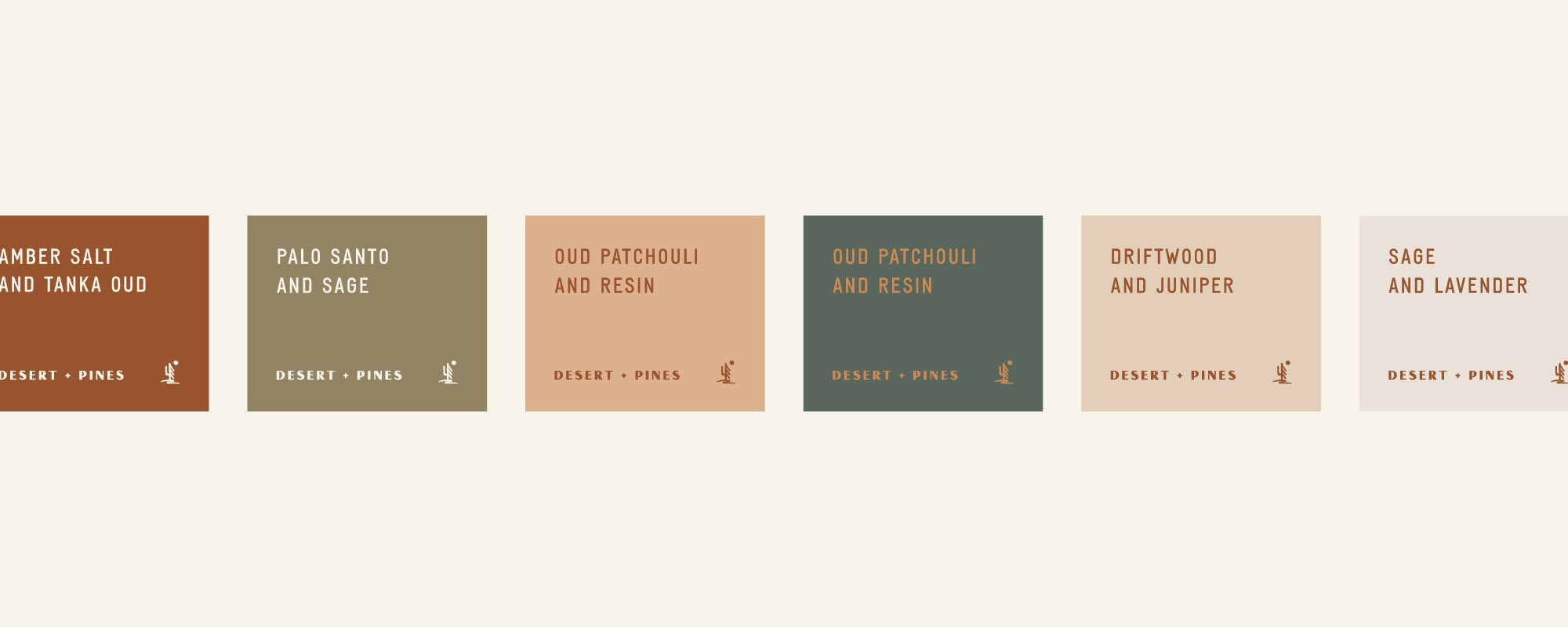
Candle Label design
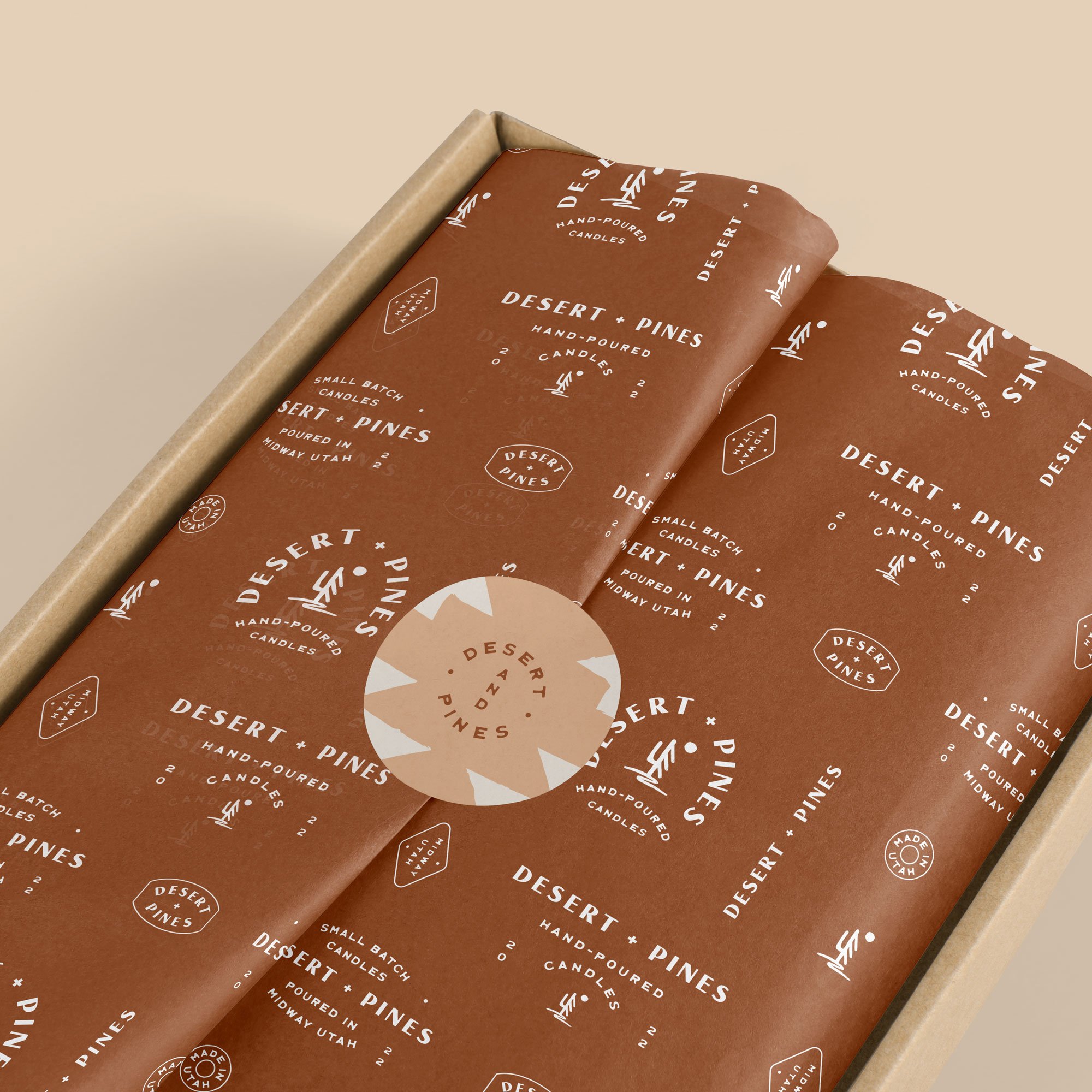
Packaging design
Overview
Born out of love for nature, the outdoors, and adventure, Desert + Pines delivers an organic ambiance to your home. They believe that the perfect scent can trigger a sense of joy and nostalgia and they want their candles to provide this type of experience to their customers in the comfort of their own home.
Objective
Develop a complete identity that pays tribute to D+P’s western roots (without being cheesy) and has an overall minimalist feel. An identity that focuses on typographic marks with different proportions so that it is able to fit the needs of the business as it grows.
The Style
Desert and Pines hails from Midway, Utah, nestled amidst dry deserts and breathtaking mountain vistas. Our aim was to evoke a Western vibe in the brand identity, without resorting to clichés like cowboy boots and hats. Instead, we leaned into stylized fonts and typographic lockups to capture the essence of the region.
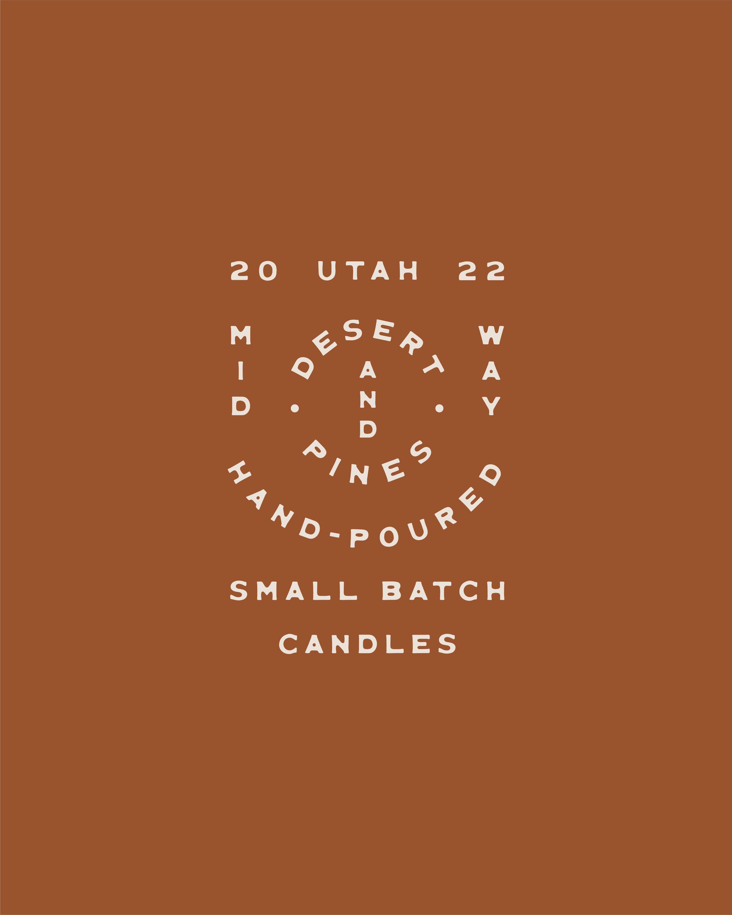
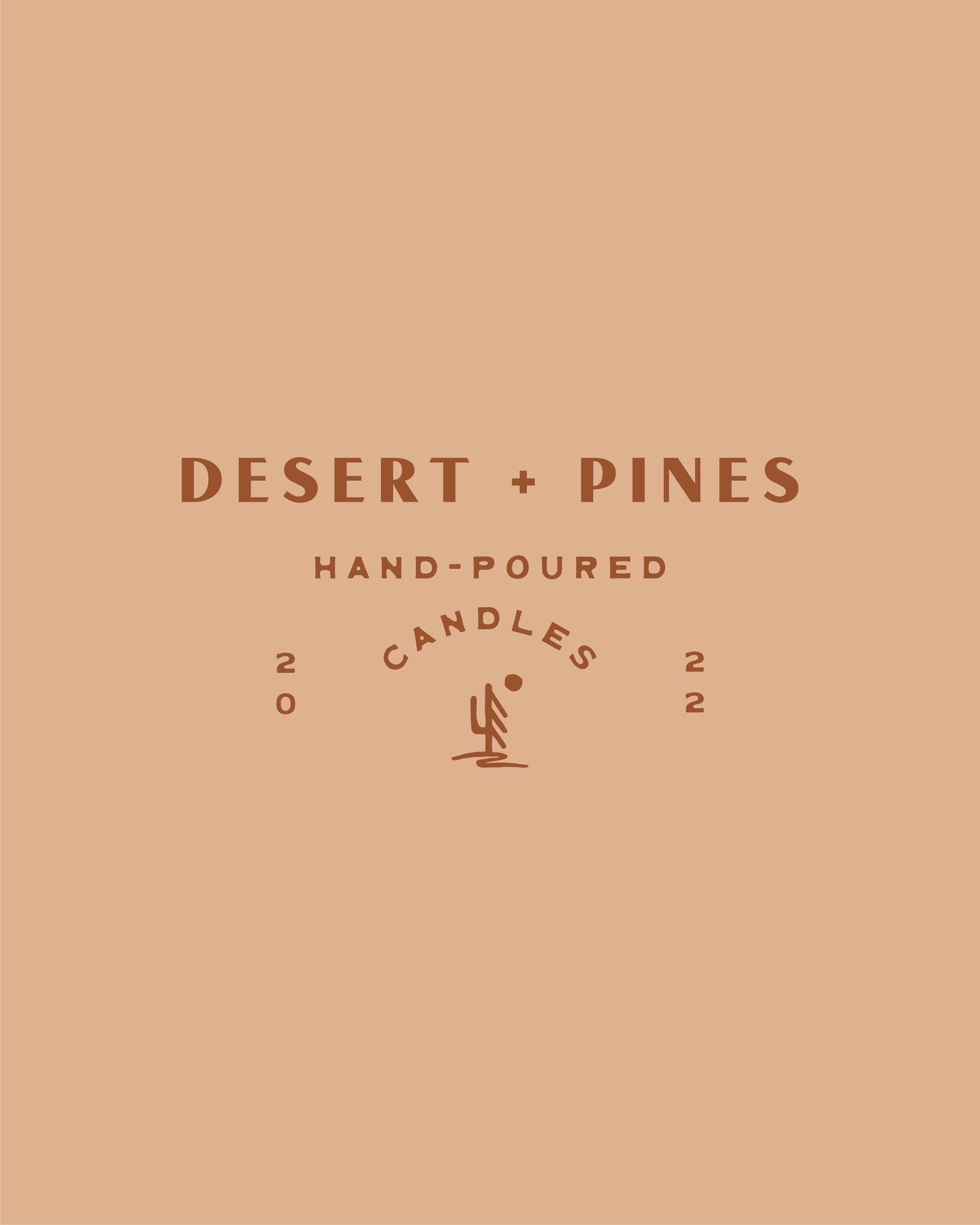

Symbol
We wanted to incorporate a symbol that represented the brand in a minimalist way. A symbol like this can be sized down proportionally without losing legibility, making it the perfect element to use throughout packaging materials, collateral designs, and social media.
The symbol, mirroring the name, features half of a cactus (representing the desert) and half of an evergreen (representing pine), offering a visual representation of the brand's identity.


Packaging design
We were able to build upon her solid brand foundation with cohesive packaging design, including candle labels, tissue paper, notecards, and tape.